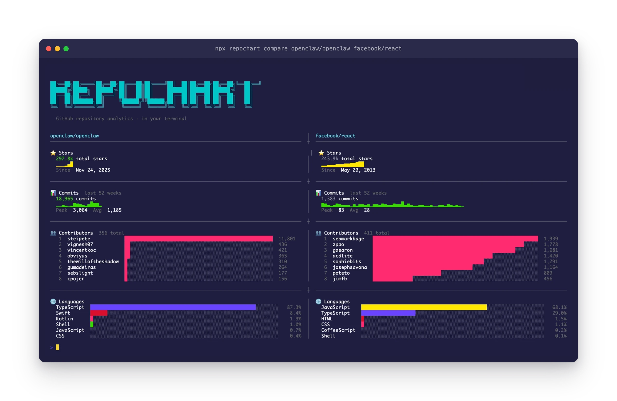
GitHub's web UI gives you a star count and a language bar. That's the extent of the analytics you get for any repository. If you want to understand the trajectory of a project, is it accelerating or stalling? Who's actually doing the work? How does it compare to alternatives?, you're left clicking through tabs and doing mental math.
repochart brings real analytics to the terminal. Run `npx repochart vercel/next.js --overview` and you get four charts in one shot: cumulative star growth as a sparkline, weekly commit activity for the last 52 weeks, top 15 contributors ranked by commits, and a language breakdown with proportional bar charts. All rendered with Unicode box-drawing characters, so it looks clean in any terminal.
The compare mode is where it gets interesting. `repochart compare vercel/next.js facebook/react` fetches all stats for both repos in parallel and renders them side-by-side, split by a divider. The winner in total stars and commits gets highlighted in green. It's the kind of view that should exist on GitHub but doesn't.
Under the hood, repochart uses the GitHub CLI (`gh`) for all API calls, no tokens to manage, no OAuth dance. Just `gh auth login` once and you're set. The parallel fetching is important: hitting 4 different GitHub API endpoints sequentially would be painfully slow, so everything fires concurrently and renders as results come in.
Built with
Links
Features
- Star growth sparklines, cumulative star history rendered as a Unicode sparkline chart
- Commit velocity, weekly commit activity for the last 52 weeks with peak/average stats
- Contributor rankings, top 15 contributors with proportional bar charts
- Language breakdown, percentage-based bar charts for all detected languages
- Side-by-side repo comparison, compare any two repos with parallel data fetching
- Overview mode, all four chart types in a single command
- Zero token management, piggybacks on GitHub CLI authentication (5,000 req/hour)
Challenges
The main challenge was rendering rich, proportional charts in a fixed-width terminal. Unicode sparkline characters (▁▂▃▄▅▆▇█) give you 8 levels of granularity, which means you need to bucket continuous data into 8 bins intelligently. For the side-by-side comparison, the terminal width constraint means dynamically calculating column widths and truncating labels without losing readability. Getting this right across different terminal emulators was trickier than expected.
What I learned
Building repochart reinforced something I keep rediscovering: the terminal is an underrated UI platform. With Unicode box-drawing characters, ANSI colors, and careful layout math, you can build surprisingly rich visualizations without any GUI framework. The constraint of fixed-width characters actually forces better information design, every character has to earn its place.